Wednesday, January 28, 2015

Erik Spiekermann

Erik Spiekermann
Just like the artist that I have discussed in the previous blog, Erik Spiekermann did not have formal training to become a graphic artist but majored in English and history of art. He later become however one of the most influential and important typographers of all time. His typographical designs include FF Meta Serif, FF Meta,FF Unit, LoType  and Berlner Grotesk amongst others. He even established one of the leading design firms in Germany - Meta Design in 1979. In addition he has also created various corporate identities for clients such as Bosch, Volkswagen and Audi. Furthermore he is also an art director for Stern. In 2001 he left Meta Design whilst a year later, his fonts for Nokia were released. In 2007 Microsoft elected him as a board of director. 

Book Cover for Stop
Stealing Sheep and find
Out how type works
Spiekermann was never in favor of the over rational German typography. As an alternative to Helvetica, he designed the Meta typefaces which have more curves and pseudo serifs in order to give each letter more life and character. Spiekermann also wrote several books including three editions of Stop Stealing Sheep & Find Out How Type Works. Spiekermann in an interview talked about he always designs fonts for a particular purpose, but it does not matter which function it serves or its purpose, it has to have a pleasing design. He also takes the identity of a company and try to make it reflect in the type that will be used. It also has to be very legible and aesthetically pleasing.


Erik Spiekermann has also designed directions that people could follow for the Berlin Transport Authority. In addition, he has also designed type for Germany's national rail system  ‘Deutshe Bahn’. In his work for Audi he designs a sans serif font were the top of the letter ‘A’ and the letter ‘d’ are shifted giving these letters an identity. His designs are very clear and orderly, in fact he even says in an interview that he cannot do anything without the use of a grid. 


Erik Spiekermann for 'Deutshe Bahn'


Erik Spiekermann for Audi


Erik Spiekermann Work at the airport


Spiekermann also has a book called ‘Hello, I am Erik’ edited, written, as well as designed by Johannes Erler in collaboration with Erik Spiekermann. In the book he has shown the progress of his work and is a visual biography. In the book he discusses his achievements as well as he shares his ideas about graphic design.Through this book one can get a good insight on Spiekermann and how we works and develops an idea.
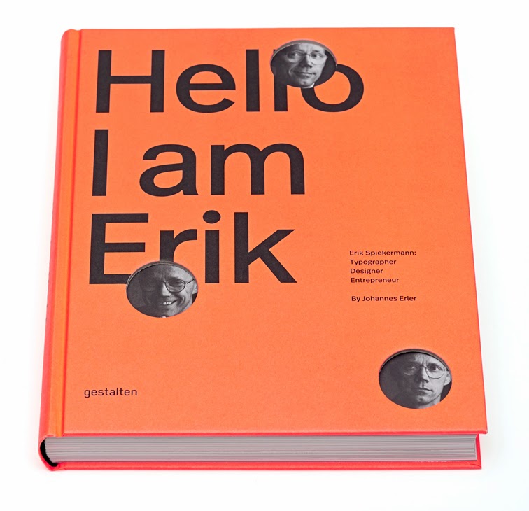
Book Cover

Page Spread from book


Page from book


Erik Spiekermann Exhbition Poster


Erik Spiekermann created a very interesting poster in order to promote his exhibition. In this poster very limited colours are used – red, grey and white. The white typography very much contrasts with the red flat background. In addition the artist made use of diagonals in order to form the word Spiekermann. It is as if the artist is playing a word search and he finally managed to find the wanted word. The fonts are not made equal whilst the artist made use of both serif and sans serif fonts. This poster is also very clean orderly and fully legible which also reflects the work that was expected to be found in this exhibition.


Spiekermann`s work is very simple and ordered and therefore I personally find it not as exiting. It is however nice to look at and very functional which is something that other artists disregarded in favor of even more expression and excitement. 
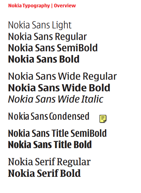

Erik Spiekermann Nokia Fonts

References:

Interview with designer and typographer, Erik Spiekermann | Webdesigner Depot. 2015. Interview with designer and typographer, Erik Spiekermann | Webdesigner Depot. [ONLINE] Available at:http://www.webdesignerdepot.com/2011/07/interview-with-designer-and-typographer-erik-spiekermann/. [Accessed 28 January 2015].

Philip B. Meggs, 2011. Meggs' History of Graphic Design. 5 Edition. Wiley

Spiekermann Exhibition Opens In Bauhaus-Archiv, Berlin | The FontFeed . 2015. Spiekermann Exhibition Opens In Bauhaus-Archiv, Berlin | The FontFeed . [ONLINE] Available at:http://fontfeed.com/archives/spiekermann-exhibition-opens-in-bauhaus-archiv-berlin/. [Accessed 28 January 2015]

David Carson

David Carson
During the 1980`s David Carson stopped being a teacher and surfer in order to become one of the most influential people in editorial design. He disregarded the use of grids, hierarchy of text and regular and orderly layouts and rejected predictable compositions in favor of expression and experimentation. His unconventional work was quite evident when he worked as a designer and art director for Transworld Skateboarding, Beach Culture and Ray Gun amongst others. He made image captions extremely tiny and the page numbers large. He used the titles of the articles as a design and a form of expression which was very unconventional and innovative at the time. 

Hans Rudolf Lutz
Carson`s also very much challenged legibility, what he was really looking for was not function and readability but expressing his inner thoughts and feelings whether be it a poster, book cover or article. Since he was never trained as an artist, what shines the most in Carson`s work is how he breaks the conventional rules. He was ignorant to these rules and therefore he just did what felt right to do at the time which make his works even more interesting. He was also influenced by the swiss designer Hans Rudolf Lutz for his experimental work. In his work for the Ray Gun magazine one can clearly see his experiments with space, type and columns amongst others. His designs reflected the content and meaning of the text. 


An interesting spread by David Carson is for the ray gun ‘choice comes to pensacola’. In an interview, Carson explained how the day before the band L7`s arrival for a concert, an abortion clinic was attacked and one of the doctors was killed. In this spread, Carson reflected the content of the article, the chaos and strangeness that these band members found upon their arrival in Florida. Especially when knowing the context of this work, one can clearly sense this chaos and confusion.  The word ‘choice’ is not completely visible as if it is hiding behind the wall because they are scared and confused. The opening spread in itself is narrating a story providing the reader with a little insight on what he will find in the article.

David Carson Ray Gun ' Choice comes to Pensacola'
An interesting work of Carson is his Ray Gun spread that covered Bray Ferry. The artist expressed how disappointed and bored he was when he read the article by changing the entire article in zapf dingbat. Of course the article was not legible but the artists expressed his feelings and it was a message to the readers that the article was definitely not worth the read.  
David Carson Bryan Ferry article for Ray Gun


David Carson Bryan Ferry article for Ray Gun


Another Astonishing work is his 2013 Poster for an art exhibition opening in Montreal.
David Carson  2013 Poster for an
Art Exhibition Opening in Montreal
The illustrations of this poster are done by Ola Carson. I very much like how the space is organized, the unconventional typography and the limited use of colour. Although you have text and illustrations that are overlapping one can still read the important details. The text is being used a design at the expense of a little loss in legibility. This poster reflects the works that could be found in the exhibition and in fact, in an interview, Carson states that if you liked this poster, you would have definitely liked the exhibition itself. I personally find this work especially interesting. I love how he is playing around with lines, thickness of lines as well as typography. 


David Carson 2014 Poster for A.I.G.A
David Carson 2014  Second Poster for A.I.G.A


References:
interview with graphic designer david carson. 2015. interview with graphic designer david carson. [ONLINE] Available at:http://www.designboom.com/design/interview-with-graphic-designer-david-carson-09-22-2013/. [Accessed 28 January 2015].

Philip B. Meggs, 2011. Meggs' History of Graphic Design. 5 Edition. Wiley

Rick Poynor, 2003. No More Rules: Graphic Design and Postmodernism. Edition. Yale University Press.


Neville Brody

Neville Brody
One of the most influential English artists that started working throughout the 80`s is Neville Brody. He is typographer, designer as well as art director. He is very much well known for his work as an art director for the face magazine. He also designed various geometric sans serif typefaces for this same magazine. In addition he has produced various album covers and also worked for the Arena magazine. Brody wanted to find a spontaneous nevertheless rational design expressing subjective ideas that could have significant meaning to the viewer. Brody was very much influenced by the Dadaist`s rejection of rules of the establishment and their experimental work along with the geometrical forms from Russian constructivism. His works very much reflect Rodchenko`s influence. Another great influence was Barney Bubbles. In his cover album Music for pleasure by the Damned, Bubbles produced a cover that is very much similar to the work of Wassily Kandinsky .Here made use of geometrical shapes, zigzag and straight lines and colours. Looking at the cover one can instantly feel the energy which reflects the content of the album.   

Whilst Neville Brody was working for the Face he was interested in reflecting the content in the headlines. As Meggs in his book states, “Brody viewed the magazine as a multidimensional object existing in time and space and maintaining continuity from issue to issue.” Furthermore the text inside along with the logo was
deconstructed into abstract glyphs. In his editorial page from the 59th issue – the interview with Andy Warhol, Brody decides to recreate Warhol`s work by placing numerous copies of his portrait next to each other. Furthermore the ‘W’ in the title is actually the ‘M’ from Madonna`s feature. This also reflects Warhol`s work were he recycled images from the popular culture of the time. The cross and circle in the title are said to represent the sexuality of this artists work and life.


Neville Brody editorial pages from
the Face no 59 March 1985


Andy Warhol - Marilyn Monroe  


In Arena, Brody used a clean approach and made use of Helvetica typography. He played around with this font however in order to give it more energy and movement. He made use of simple and clear layouts and made use of contrasts.

Page Spread from Arena Magazine - Neville Brody

Page Spread from Arena Magazine - Neville Brody


Neville Brody1988 Nike Advertisement 
One of most popular works by Brody is his 1988 Nike advert. Over here Brody uses the text as part of the image. It is not simply there to give addition information it is part of the design itself. Furthermore, there is a sense of movement in the text by making use of verticals and horizontals. In addition the images of the shoes are also interacting with the text. Brody also makes use of contrasts. He divides the advertisement in half, on the right there is a light background so there is the use of black sans serif Helvetica type, whilst on the left the background is darker so he uses white typography. Very limited colours are used for the typography; red and blue along with black and white. Although the artist played around with typography it is still very much legible. This composition is also asymmetrically balanced.


Neville Brody is still very much producing impeccable works today. He has inspired and will continue to inspire many artists in the future. I personally like his works very much. The way he uses contrast and typography is very interesting. It is also like the way he makes the images and text interact as well as the text and the content. 

Blackhat 2014 

Christian Dior Identity 2014


References:

Philip B. Meggs, 2011. Meggs' History of Graphic Design. 5 Edition. Wiley

Rick Poynor, 2003. No More Rules: Graphic Design and Postmodernism. Edition. Yale University Press.


Tuesday, January 27, 2015

Wolfgang Weingart

Wolfgang Weingart
Wolfgang Weingart, one of the most influential graphic artists of all time,is mostly known for his experimental typography which inspired artists around the world. Furthermore, his approach to typography influenced the development of the new wave and deconstruction. In 1963 he received a request from Armin Hoffman in order to teach typography at the Basel School of Design. Weingart was very much influenced by Emil Ruder and Armin Hoffman however he had different principles. Unlike his mentors he questioned absolute order and cleanness which was evident in his teachings. Weingart stated “I was motivated to provoke this stodgy profession and to stretch the typeshop`s capabilities to this breaking point, and finally, to prove once again that typography is art”. 


HHHis work was full of energy and was very lively, spontaneous and experimental. In addition he played around with weight, size, legibility and diagonals. He was not constrained by the principles of Swiss modern typography. He liked to stretch out and experiment with the spacing in between the letters. To him there were endless possibilities. He even was innovative in the way he produced these designs; He manipulated the metal typesetters along and pieces of photographic films in the dark room in order to create an extraordinary design that engages the viewers. He made use of overlaying of images, lettering and text. 

Weingart`s typographic Experiments 1971


His overlaying of images can be seen in his exhibition poster made in 1981. He also made halftone marks bigger and made use of moire designs – patterns that are shaped when you overlay and these halftone marks and then shift them. There is a great sense of movement in this work. Although it has movement it is still quite somewhat ordered.The artist used different shades of black and white instead of making use of colour.In contrast to this is his 1984 Das Schweizer Plakat exhibition poster were here, he makes use of the colours red and yellow. The two colours are allowed to intermingle by using overprinting producing dimensional layers. One again we have a sense of movement in this poster. The composition is also somewhat similar were both of these posters having an outside boarder with text and images in the middle. The boarder seems to have a kind of pattern inside which is composed of lines and geometrical shapes. Furthermore in both of these posters we can see the use of a sans serif font. 


Exhibition Poster 1981
Das Schweizer Plakat exhibition
Poster 1984


'My way to Typography' cover 2005
In 2005 he published his book called ‘ My Way To Typography’. This book has a very interesting cover although quite simple, the way he uses typography is very exciting and intriguing. He makes use of diagonals and cuts the words diagonally in half. The word ‘Typography’ is not completely there although it is still legible. One again he makes use of very limited colours; orange and yellow. On the other hand, it is not simply the cover that makes this book so fascinating but the content inside. The layout used is very interesting and the way he placed text is not so conventional. He is once again playing around with text, images and shape whether to create the cover or the content inside the book. 

Page spread from the book

Page Spread from the book


I personally found Weingart`s work very interesting. The way he played around with the letters was very unconventional then and still looks fresh and modern now. It is interesting how he rebelled against the systematic rules of modern Swiss typography. 

References:

Philip B. Meggs, 2011. Meggs' History of Graphic Design. 5 Edition. Wiley

Steven Heller, 2012. 100 Ideas that Changed Graphic Design. 3.3.2012 Edition. Laurence King Publishing.

AIGA | Wolfgang Weingart . 2015. AIGA | Wolfgang Weingart . [ONLINE] Available at: http://www.aiga.org/medalist-wolfgang-weingart/. [Accessed 27 January 2015].


Saturday, January 17, 2015

Early Swiss Post Modern Design

Work From the International
typographic style

During the International typographic style hints of postmodern design started to emerge. This movement made use of natural and objective typefaces. They rejected disorder and subjectivity and favoured simplicity and scientific objectivity.  Young graphic designers started to expand the range of possibilities in the 1960s and one of the earliest indications of that was Rosmarie Tissi`s advertisement in 1964.


Advertisement for E.Luz and company
by Rosmarie Tissi 1964 


This advertisement was made for E.Lutz and company. In this advert we can see a number of symbols of headlines, text, halftones etc through the means of illustrations. To the viewer it seems as if these images were randomly placed. These images are therefore not aligned in boxes in the grid. Furthermore, some of the rule lines are created by a means of illusion which creates more interest to the viewers. No colours were used in this poster. In addition the artist also made use of diagonals especially in the text at the bottom right of the poster.


Siegfried Odermatt trademark
for the Union Save Company

Another predecessor of Swiss design was Siegfried Odermatt when he designed a trademark for the Union Safe Company. The letters in the word ‘union’ are squeezed together in order to show strength reflecting the potency of the product. This is done at the expense of losing a little bit of legibility. The typography used (which is sans serif) is placed in a diagonal manner. This work is somewhat similar to the advertisement by Tissi especially the way text is placed and the use of black and white.


Tissi and Odermatt  then started working on typeface design where their originality shined. They managed to create innovative and unusual letterforms as can be clearly seen in the cover issue of Graphis in 1980 by Tissi. The artist managed to make the typography appear as if it is three dimensional. This type was very innovative at the time. The word ‘Graphis’ is forming a perfect curve dividing the composition in two creating a clean and ordered work. Also the grids used in order to show this dimensionality are also visible. 
Rosmarie Tissi Graphis cover 1980


Schriftgestaltung  1972 Rosmarie Tissi

Steff Geissbuhler, Geigy
Brochure cover 1965


Steff Geissbuhler was another important swiss designer that experimented greatly with intricate forms. In 1965 he created a brochure cover for Geighy.In this cover one can see a flat black background with typography in white which is distorted in such a way that it forms a circular tunnel in the middle. The typography (which is in sans serif font) is forming a circle and it is as if the text is being sucked by the black hole in the middle. This poster is very interesting to the viewer.


These designer`s works still look fresh and modern. Rosmarie Tissi`s work has inspired artists such as Paula Scher for “its modernity, its beauty and precision”. It seems as if this influence can be seen in her 1997 poster ‘Bring In 'Da Noise, Bring In'Da Funk’ where the word 'noise' seems to be decreasing in size whilst further text is placed diagonally in different directions as if its cut out and pasted in different directions.


Paula Scher 1997 poster 'Bring In`da
Noise, Bring in'Da Funk`
Rosmarie Tissi, poster for Anton
Schob printers 1985


I personally find these works especially interesting. Typography is not simply used to deliver a message but typography itself is part of the design which I found to be very intriguing especially in Geissbuhler`s brochure cover in 1965.

References:

Philip B. Meggs, 2011. Meggs' History of Graphic Design. 5 Edition. Wiley.

Samuel Tam's blog: Field Journal. 2015. Samuel Tam's blog: Field Journal. [ONLINE] Available at:http://samueltamsblog.blogspot.com/2013/11/normal-0-10-pt-0-2-false-false-false-en.html. [Accessed 17 January 2015].

Hall of Femmes | L’hommage: Paula Scher > Rosmarie Tissi. 2015. Hall of Femmes | L’hommage: Paula Scher > Rosmarie Tissi. [ONLINE] Available at: http://halloffemmes.com/2014/10/lhommage-paula-scher-rosemarie-tissi/. [Accessed 17 January 2015].