 |
| Erik Spiekermann |
Just
like the artist that I have discussed in the previous blog, Erik Spiekermann
did not have formal training to become a graphic artist but majored in English
and history of art. He later become however one of the most influential and
important typographers of all time. His typographical designs include FF Meta
Serif, FF Meta,FF Unit, LoType and
Berlner Grotesk amongst others. He even established one of the leading design
firms in Germany - Meta Design in 1979. In addition he has also created various
corporate identities for clients such as Bosch, Volkswagen and Audi. Furthermore
he is also an art director for Stern.
In 2001 he left Meta Design whilst a year later, his fonts for Nokia were
released. In 2007 Microsoft elected him as a board of director.
 |
| Book Cover for Stop Stealing Sheep and find Out how type works |
Spiekermann
was never in favor of the over rational German typography. As an alternative to
Helvetica, he designed the Meta typefaces which have more curves and pseudo
serifs in order to give each letter more life and character. Spiekermann also
wrote several books including three editions of Stop Stealing Sheep & Find
Out How Type Works. Spiekermann in an interview talked about he always
designs fonts for a particular purpose, but it does not matter which function
it serves or its purpose, it has to have a pleasing design. He also takes the
identity of a company and try to make it reflect in the type that will be used.
It also has to be very legible and aesthetically pleasing.
Erik
Spiekermann has also designed directions that people could follow for the
Berlin Transport Authority. In addition, he has also designed type for Germany's
national rail system ‘Deutshe
Bahn’. In his work for Audi he
designs a sans serif font were the top of the letter ‘A’ and the letter ‘d’ are
shifted giving these letters an identity. His designs are very clear and
orderly, in fact he even says in an interview that he cannot do anything
without the use of a grid.
 |
| Erik Spiekermann for 'Deutshe Bahn' |
 |
| Erik Spiekermann for Audi |
 |
| Erik Spiekermann Work at the airport |
Spiekermann
also has a book called ‘Hello, I am
Erik’ edited, written, as well as designed by Johannes Erler
in collaboration with Erik Spiekermann. In the book he has shown the progress of
his work and is a visual biography. In the book he discusses his achievements
as well as he shares his ideas about graphic design.Through
this book one can get a good insight on Spiekermann and how we works and
develops an idea.
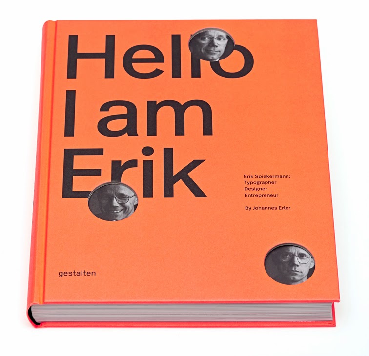 |
| Book Cover |
 |
| Page Spread from book |
 |
| Page from book |
 |
| Erik Spiekermann Exhbition Poster |
Spiekermann`s work is very
simple and ordered and therefore I personally find it not as exiting. It is however nice to look at and very functional which is something that other artists
disregarded in favor of even more expression and excitement.
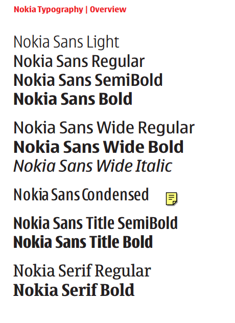 |
| Erik Spiekermann Nokia Fonts |
References:
Interview
with designer and typographer, Erik Spiekermann | Webdesigner Depot. 2015. Interview
with designer and typographer, Erik Spiekermann | Webdesigner Depot.
[ONLINE] Available at:http://www.webdesignerdepot.com/2011/07/interview-with-designer-and-typographer-erik-spiekermann/. [Accessed 28 January 2015].
Philip B. Meggs, 2011. Meggs' History of Graphic Design. 5 Edition. Wiley
Spiekermann
Exhibition Opens In Bauhaus-Archiv, Berlin | The FontFeed . 2015. Spiekermann
Exhibition Opens In Bauhaus-Archiv, Berlin | The FontFeed . [ONLINE]
Available at:http://fontfeed.com/archives/spiekermann-exhibition-opens-in-bauhaus-archiv-berlin/. [Accessed 28 January 2015]


.jpg)


